Mailroom Dasboard
📊 Mailroom Management Dashboard
The Mailroom Dashboard provides a complete view of parcel activity, costs, and courier performance.
It is divided into multiple sections for better insights.
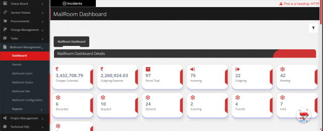
1. Parcel Overview
- 📦 Total Parcels (Incoming & Outgoing)
- ✅ Status-wise Counts (Delivered, In Transit, Pending, Returned, etc.)
- 💰 Total Expenses (overall)
-
📤 Outgoing Expenses
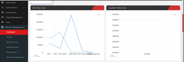
2. Cost Analysis by Site & Location
- 🏢 Site-wise Costing Graph
- 🌍 Location-wise Costing Graph
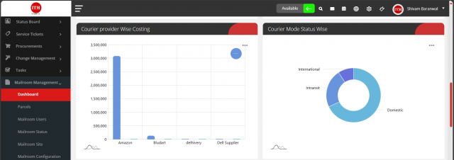
3. Courier Provider & Mode Insights
- 🚚 Courier Provider-wise Costing
- 📦 Courier Mode Donut Chart:
- International
- In Transit
-
Domestic
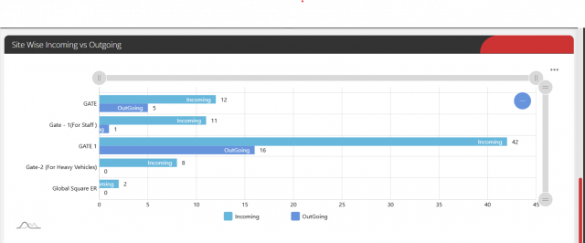
4. Site-wise Flow
- 🔄 Incoming vs Outgoing (per Site)
- Displayed as a Line Chart to compare trends over time.
Site Wise Status
- 🔄 status wise count of the parcels (per Site)
-
Site-wise Parcel Count by Status (Bar Chart)

We are continuously improving our documentation to ensure it meets your needs. This document will be updated regularly, so please check back for the latest information. If you have any questions or encounter any issues, feel free to reach out to us at support@itassetmanagement.in.